Post

Visualizzazione dei post con l'etichetta data visualization

is your point clear? - storytellingwithdata

Have you ever found yourself staring at a graph or slide, wondering what the creator was trying to convey? Perhaps you've sat through a presentation, only to be left scratching your head, unsure of what to do next. Don’t put your audience in this same uncomfortable position. Instead, connect the dots for them to make it clear what the point is and what action they should take. When you fail to explicitly state the purpose of your communication, you run the risk of the important insight being lost, or someone arriving at the wrong conclusion. Read more:  https://www.storytellingwithdata.com/blog/is-your-point-clear
everything they need, nothing that they don't - storytelling with data

 I’ve always had a fascination with the discipline of “wayfinding,” which is a term describing the ways architects, city planners, designers, and artists make it as easy as possible for people to navigate unfamiliar places.  Think back to the last time you visited an amusement park, attended a sporting event or large concert, or passed through an airport or a public transportation system. These venues are visited by tens of thousands of people in a single day, many of whom have never been there before. For the enjoyment and safety of everyone, it’s critical (and, in many cases, legally required) that there be clear, visible, and authoritative signage physically present to help people get around the space and find what they’re looking for.  What’s fascinating to me is that wayfinding is so frequently context-specific. Rather than just posting maps of the whole airport, amusement park, or stadium, wayfinding is based much more around where you, the visitor, are standing at ...

Data drawing: cos'è e perché è utile?

Immagine
Il data drawing ,  "disegno dei dati", è una tecnica che consiste nel visualizzare dati e informazioni attraverso il disegno a mano libera. Invece di utilizzare software di visualizzazione dati, si utilizzano carta, penna e matita per creare grafici, diagrammi, illustrazioni e altre rappresentazioni visive dei dati. Perché utilizzare il data drawing? Esistono diversi vantaggi nell'utilizzo del data drawing: rapidità e flessibilità: è un modo veloce e flessibile per esplorare diverse idee e visualizzazioni; semplicità e chiarezza: il disegno a mano libera aiuta a concentrarsi sull'essenza dei dati, eliminando le distrazioni degli strumenti digitali; creatività e originalità: permette di esplorare nuove possibilità e di creare visualizzazioni uniche e personalizzate; comprensione e apprendimento: il processo di disegno può aiutare a comprendere meglio i dati e a fissare i concetti in modo più efficace. A chi è utile il data drawing? Il data drawing può esser...

La passione per i dati - Internazionale

Hai mai provato a descrivere la tua giornata usando i dati invece delle parole? È quello che hanno fatto due designer scrivendosi cartoline per un anno. Giorgia Lupi e Stefanie Posavec si sono conosciute anni fa a un festival di arte e hanno scoperto di avere una passione in comune: la raccolta delle informazioni. Vivono in due città diverse, ma hanno deciso di rimanere in contatto e diventare “amiche di penna”, cioè due persone che si scrivono regolarmente. Ma invece di descrivere le loro giornate a parole, hanno cominciato a disegnare le loro esperienze. Le loro cartoline sono diventate un importante progetto artistico contenuto nel libro Dear data, che significa “cari dati”. Leggi tutto:  https://www.internazionale.it/notizie/elizabeth-pagel-hogan/2024/01/24/passione-dati-dear-data Per approfondire il progetto:  https://www.dear-data.com/theproject

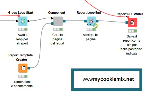
Creare un report in pdf con l'estensione Reporting in Knime

Immagine
Per iniziare, due parole su KNIME "KNIME è una piattaforma open source di analisi dati, reportistica e integrazione. È basata su un'interfaccia grafica drag-and-drop che permette di assemblare nodi per la preprocessazione dei dati (ETL), la modellazione, l'analisi e la visualizzazione dei dati". Più o meno questo è quello che trovi se digiti "cos'è Knime?" su di un motore di ricerca. Io, invece, descriverei Knime con uno strumento (software) che permette di entrare nel fantastico mondo dell'analisi dei dati senza dover necessariamente conoscere un linguaggio di programmazione. Funziona un po' come i mattoncini Lego -  ce ne sono di diverse forme e colori e, unendoli, si possono ottenere astronavi, castelli o macchine da corsa - solo che Knime, al posto dei mattoncini, ha degli oggetti che chiama "nodi" e, unendoli opportunamente, puoi caricare i tuoi dati, analizzarli, trasformarli e farci mille altre cose. Ad esempio: produrre un repo...

The Future of Data Visualization: 2024 and Beyond - Mokkup.ai su Medium

As we move into the next era of data-driven decision-making, the field of data visualization is poised for a transformative revolution. With the continuous influx of information and the ever-increasing complexity of data, traditional visualization methods need help to keep pace. Emerging technologies, such as artificial intelligence, machine learning, and augmented reality, are paving the way for a new generation of real time data visualization tools that will enhance our ability to understand complex data and revolutionize how we interact with it. In this article, we will explore the future of data visualization, highlighting key trends and predictions for 2024 and beyond. We will delve into the role of AI and ML in automating data analysis and generating insights, the rise of real-time data visualization, and the increasing adoption of immersive and interactive visualization techniques. We will also discuss the importance of data democratization and the need for tools that empower ...

how to avoid the “Christmas tree effect” - storytelling with data

 Anche se siamo in pieno periodo natalizio "È fondamentale evitare l'effetto albero di Natale nel design grafico e nelle visualizzazioni dei dati. Considerate come dashboard, presentazioni e report tendono a evolversi nel tempo. Ogni iterazione successiva spesso aggiunge grafici, diagrammi e punti elenco nel tentativo di trasmettere più informazioni. Tuttavia, ciò si traduce solitamente in presentazioni disordinate, confuse e difficili da seguire.  A livello pratico, l'effetto albero di Natale può portare a grafici e diagrammi così pieni di indicatori, linee di tendenza e annotazioni da nascondere il messaggio principale. Questo rumore visivo può distrarre dalle informazioni che i dati dovrebbero rivelare, portando a un'interpretazione errata o a una situazione di paralisi dell'analisi in cui non è possibile prendere alcuna decisione con sicurezza." Buona lettura:  https://www.storytellingwithdata.com/blog/how-to-avoid-the-christmas-tree-effect

Best Open Source replacements for Business Intelligence Tools Power BI, Tableau, Looker, MicroStrategy - Alex Wong su Medium

These are the top 4 open source replacements for Microsoft Power BI, Tableau, Looker, MicroStrategy and other Business Intelligence and Data Visualization Tools: Apache SuperSet Metabase Lightdash Streamlit Read more:  https://atwong.medium.com/best-open-source-replacements-for-business-intelligence-tools-power-bi-tableau-looker-3857ea58737d

#SWDchallenge: annotate it! - storytelling with data

Immagine
Words play an important role when communicating with data because they help our graphs make sense to your audience. One place we can incorporate meaningful text is in the form of chart annotations that highlight key data points, explain trends, or add clarity to complex information. When we don’t use annotations, it often requires our audience to do unnecessary work to understand our graphs. Read more:  https://www.storytellingwithdata.com/blog/swdchallenge-annotate-it See also...

Data visualization (Cosa si intende per data visualization?)

Data visualization is the graphical representation of information and data. By using visual elements like charts, graphs, and maps, data visualization tools provide an accessible way to see and understand trends, outliers, and patterns in data. Additionally, it provides an excellent way for employees or business owners to present data to non-technical audiences without confusion. In the world of Big Data, data visualization tools and technologies are essential to analyze massive amounts of information and make data-driven decisions. ( https://www.tableau.com/learn/articles/data-visualization ) Data visualization is the practice of translating information into a visual context, such as a map or graph, to make data easier for the human brain to understand and pull insights from. The main goal of data visualization is to make it easier to identify patterns, trends and outliers in large data sets. The term is often used interchangeably with others, including information graphics, informa...

Announcing Python in Excel: Next-Level Data Analysis for All - Anaconda

Today, Anaconda and Microsoft announced a groundbreaking innovation: Python in Excel. This marks a transformation in how Excel users and Python practitioners approach their work. For Excel users, this opens a new world of data analysis potential previously limited to data scientists and developers. Within your familiar spreadsheet environment, you can now harness Python’s power to perform complex statistical analyses with popular packages such as pandas and statsmodels and create sophisticated visualizations using Matplotlib and Seaborn. Python practitioners can now marry scripts and rich visualizations with the widespread accessibility of Excel, enabling an uninterrupted workflow and making your work easier to share with colleagues who primarily use Excel. The integration of the Anaconda Distribution for Python in Microsoft Excel is more than a feature; it’s a redefinition of what’s possible within data analytics. It combines Python’s advanced capabilities with Excel’s familiar in...

Excel gets containerized, cloud-based Python analytics and visualization powers - arstechnica

Microsoft partnered with Python analytics repository Anaconda to bring libraries like Pandas, Statsmodels, and Matplotlib into Excel. Python in Excel runs on Microsoft’s cloud servers, and the company is touting the security that should offer. Python runs in isolated containers, with no access to devices, your network, or user tokens, Microsoft states. Python and Excel can only really talk to each other through limited functions—xl() and =PY()—that can only return code results, not macros, VBA code, or other data, Microsoft claims. Read more:  https://arstechnica.com/information-technology/2023/08/you-can-now-wield-python-analytics-inside-excel-but-microsoft-says-its-safe/

declutter a dual y-axis chart - storytelling with data

 Have you ever felt overwhelmed when you open an overflowing, unorganized closet or enter a crowded room? It’s a common reaction when you receive too much visual input at once. We often experience this same uncomfortable feeling when presented with too much information in a graph. Consider the following dual y-axis chart and take note of how it makes you feel. [image] You may be confused and overwhelmed at first. Dual-axis graphs like this are inherently challenging. Whether you call them dual-axis graphs, combo charts, or secondary y-axis graphs, they always demand extra effort from a reader to figure out which data series to read against which vertical axis.  Read more:  https://www.storytellingwithdata.com/blog/declutter-a-dual-y-axis-chart

sketch then create - storytelling with data

American painter John Singer Sargent intended this advice for artists working in traditional media like wood, paint, or charcoal. It also applies to data visualization practitioners. After all, we too are artists, simply working in a slightly different medium—information. Whenever I’m unsure of how to display my data, I start sketching to generate ideas and gain clarity. I sit at my whiteboard or grab my tablet and draw a handful of charts that could work for my dataset—allowing myself to be curious and free from the constraints of my graphing tool. Read more:  https://www.storytellingwithdata.com/blog/unsure-of-how-to-graph-data-sketch-it

what is a unit chart? - storytelling with data

Unlike other charts that use line length, position on an axis, or area to represent values, unit charts are made up of individual markers—geometric shapes, icons, images, etc—that encode quantities based on how many of that unit are shown. Examples of unit charts are ISOTYPE charts, square area charts (also known as waffle charts), symbol charts, and pictorial charts. They are commonly used in media, advertisements, and infographics. Read more:  https://www.storytellingwithdata.com/blog/what-is-a-unit-chart

Identifying tension in data stories - storytelling with data

Tension is an important part of any good story. Without it, things fall flat (or rather, they remain flat, because there’s nothing to lend shape!). Tension is a key component of data stories, too. That said, understanding and aptly articulating tension so that it can be used to communicate in a business setting can sometimes feel like an elusive process. In this short post, I’ll share several strategies that can help you identify tension, with the promise that taking a few minutes to do so will markedly improve your next graph, slide, or presentation. Read more:  https://www.storytellingwithdata.com/blog/identifying-tension-in-data-stories

build a story, not a dashboard - storytelling with data

I had an impromptu consulting session yesterday with a friend who was looking for guidance on how to visualize data for an important new initiative he is spearheading at work. As he was animatedly sharing the context, anticipated resistance, and what he felt was a paramount opportunity, there was a term that surprised me, coming up in the conversation several times: dashboard. As in, the correctly constructed “dashboard” would solve everything. Read more:  https://www.storytellingwithdata.com/blog/build-a-story-not-a-dashboard

create effective executive summary slides - storytelling with data

 "Le comunicazioni aziendali spesso richiedono una presentazione e di immediata comprensione. Si tratta di un documento comunemente chiamato executive summary (anche se ne trarranno beneficio molti destinatari, oltre ai dirigenti). Nonostante siano onnipresenti, può essere difficile progettare documenti di sintesi che siano chiari e concisi. In questo articolo, cercherò di ridurre la fatica mostrando un esempio di executive summary , condividendo le migliori pratiche e offrendo layout alternativi, in modo che la prossima volta che dovrete creare una slide di sintesi di una pagina, basata sui dati, sarete pronti per il successo!" Leggi tutto:  https://www.storytellingwithdata.com/blog/2022/1/14/executive-summary-slides